Showing posts with label research and planning. Show all posts

Thursday, 2 May 2013

Evaluation - "How did you use new media technologies in the construction and research, planning and evaluation stages?"

Throughout the course of putting together my productions, I've relied on a wide variety of different pieces of technology. This has been a consistent feature of production, and I've made use of lots of pieces of hardware and software at every single step, from the early research to showing off the final products. In this post I am going to cover everything which has been beneficial to me during this year.

First up is the hardware.

Apple iMac


This has pretty much been the main base throughout most of the project; specifically the video production.

  • Supports Final Cut Pro 7 (more on that later) which I've used to actually put the video together.
  • Has an internet browser (Safari); necessary for research.
Sony Bloggies
  • As I have had access to my own one of these I used this for filming the outside narrative parts of the music video. It has a reasonably decent picture quality for these parts.
  • I had initially attempted using these to film the performance shots, however they didn't seem to cope too well with the darkness.

Nikon SRL Cameras


The better, more expensive cameras which were available.

  • As I didn't have the opportunity to take these away from the school grounds, I wasn't able to use them for the outside shots... but they were great for the performance parts of the video. During the stationary shots they were attached to tripods, and for the moving shots, I had Sir run around with one (quite literally with the "crazycam" shots...). 
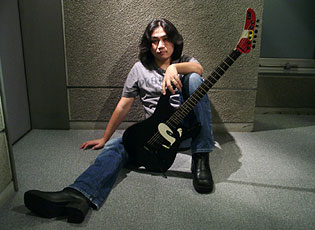
  • They can also take high resolution still photographs, so I had Sir take the photograph which I'd use on my digipak and promotional poster with one.


As for software...

Final Cut Pro 7


This has been the base for everything in terms of putting the music video together in post-production. It has quite a significant number of different parts which I've employed throughout the entire process -

  • File management: all the videoclips I've imported are easily accessible in the Browser (and playable in the Viewer), which made the process of critically analysing each shot to determine whether it is usable much easier.
  • The Canvas has let me play the video through as I was working, which let me see what I was doing. This is typically a pretty useful thing. The slight drawback with this is that at times it can be a bit laggy (which I put down to the presumably not-so-great RAM on the Mac; unfortunately I can't check the exact specs because the permissions won't allow me to. My nerd self is disappointed...) which makes it particularly difficult to accurately sync up the visuals (my lip-syncing) to the audio. This means that I've had to resort to ultra precise editing when zoomed in to the track to sync the two (otherwise known as the "left a bit, right a bit" method), and I'm still not convinced that everything is perfect because of this.
  • The Timeline is where the main magic happens... or something. This is where I've put everything together - as you can see from the screenshot, I've used what some would see as an unconventional timeline management system by piling several of clips on top of each other as opposed to just using a main track and a few overlay tracks - but there is logic behind this. This was in fact to try and work around my syncing problems - I got all of the main performance takes as close in sync as was possible (I stress the "as possible", my lip-syncing isn't perfect, which is another reason why I had to resort to the previously mentioned "left a bit, right a bit" technique") and used the Razor Blade tool to cut the clips to shape.
On top of just using the main parts of the application which are handed to you on a plate, I dug a bit deeper and made use of some other tools...

  • Image+Wireframe: some of the shots needed a bit of cropping - one of the performance takes which was otherwise a good take had a bit of an unwanted door in the shot over to the right; I used the Wireframe to zoom in so this is out of view. I also used the zoom to give a bit more variety in how close to my face the camera appears to be - which to an extent followed Sir's suggestion of making the production "more crazy".
  • Colour Correction: Most of my video is in greyscale, because DARK and EDGY = cool. For the sake of making the greyscale effect, I just reduced the saturation to the absolute lowest - though FCP's Colour Correction tool can also adjust the balance of the blacks and whites, which I've deliberately tampered with from shot to shot as an additional little touch to support the whole dark vs. light concept.
  • Gaussian Blur: Tied with some stock fade transitions to make that cool little flicker blur to nothing effect at the very end of the video.
MPEGStreamClip


This, at first, looks like a basic media player, akin to QuickTime or Windows Media Player; but it has an incredibly useful function which I discovered when working on personal projects about a year or so ago - it can be used for converting and compressing video files. I've used it to convert the .mov output files from FCP into .mp4 files - I've found .mp4 files typically have lower file sizes whilst still being of a decent quality - so I've used it whenever I've had either a draft or some kind of video to post on this blog, so I didn't have to wait a decade for the thing to upload.

Adobe Photoshop CS6


(Photo from elsewhere because I'm not using a computer with PS installed right now to screenshot for myself. I would link to the site for the sake of attribution, but said site appeared to be teaching others how to go about pirating the software, and that's no good...)

Used for the creation of both the digipak design, and the poster design. I've covered more specifics into how I used the software for the poster in the video here, but I should clarify that I used similar techniques for the digipak production as well. 

I used Photoshop because a) I've been using it for years for different things and so I sort-of have an idea of what I'm doing and b) it's a pretty powerful piece of software with a lot of editing options.

Microsoft PowerPoint


I'm going to be honest - I don't like PowerPoint in the slightest because it has a hideous UI and I have to look at one of the things every time someone wants to present anything, but I will grudgingly admit that it can be beneficial in some very specific situations (by which I mean laying things out in bullet point format with the odd picture). Hence why some of the blog posts here have PowerPoint embeds.


I've taken advantage of this by using social media to gain input from potential future audience members as to what they want to see in productions, for the sake of research...

Web forums

As seen when I conducted early research into fans of the rock genre, web forums can be useful for collecting feedback from specific audiences - this is because most forums revolve entirely around specific areas of interest, and in this case I was able to ask the members of two music-oriented forums for their opinions.

Social networking (e.g. Facebook/Twitter)


We're at a point now where practically everyone in western society uses a social networking site of some kind, and if we ignore the fact that a great deal of what you see on them consists of invites to play stupid Flash games and fifteen year olds going on about how they want to go out and get drunk, they can be pretty useful tools for asking your friends for their opinions on different factors which help shape a production. They were also useful for promoting polls (see below) as I could prompt people I know to go and fill them out.

Polldaddy

Polls and surveys can be pretty useful for getting generalised overviews of people's opinions, and Polldaddy is a particularly great way of doing this as it gives good numerical breakdowns of the responses gathered, as we can see to a degree here.

YouTube
Over the course of production, I've been able to upload my drafts as a kind of production log, as well as upload other videos (such as my Photoshop poster video) explaining how I've done certain things. We may moan about YouTube whenever they change the layout etc., but at the end of the day, it's a very useful site for sharing videos.

Blogger
This really goes without saying, given that you're reading this on a blog which is hosted on Blogger, but I've made use of it to document my progress on both the music video and the ancillary tasks. I've also been able to get feedback on my work, as Blogger has a comments function.


So, ahem, I didn't realise this post would be so long. Eh. I hope it has filled your minds with plenty of informatively informative information about the ways in which I've made use of technology throughout the project.

-HM.

Friday, 12 April 2013

Ancillary Production - Revised front/back covers


So, here are the revised versions of the front and back digipak covers. I've made the changes I said I would in the previous version's post, but the more observant folks may have noticed some more updates.

Firstly, the institution information is now present - it references "Metallic Records"; get it, because metal? I am so funny. But in seriousness, it seems appropriate because it describes the kind of music they sell. There is also an anti-piracy warning. No copyright law in the universe is going to stop me!

The more obvious of the changes? I've used some royalty free Photoshop brushes to add a bit of texture to both panels. Why?

Well, I was looking at the album chart earlier, and I noticed a bit of a trend:


Whilst following conventions can be useful to a degree, it dawned on me that an album isn't going to stand out on a shop shelf if there are two other albums which look the same. Because of this, it seemed appropriate to add a bit of uniqueness to the front cover. I then decided to add similar brushwork to the back cover to keep it consistant with the front.

Now left to go are the inside panels. I thought I'd initially prioritise perfecting the front and back covers as they are the parts which need to sell the album, but the inside panels are coming soon. Be excited; one of them has a closeup of my beautiful Black Knight.

-HM.

Saturday, 2 March 2013

Music Video Props

Hey folks,

I thought it'd be a good idea to make a note of the props which I've made use of so far in the I Am... All of Me music video. These are actually surprisingly limited given the fact that it's a four minute video, though when you consider that props are usually more necessary to aid a narrative, and my video is performance heavy (as per my research into existing rock videos) it makes a bit more sense as to why.

Black Knight guitar


I've used this for the performance shots in the video. This is purely to conform to one of the rock video conventions I found from the videos I've researched, in that emphasis is placed on the performer playing guitar.


Why have I used this particular guitar then? It's because it's quite similar in design, and more importantly sound output, to the guitars Jun Senoue (the guitarist in Crush 40) is known for playing.


As one of Goodwin's conventions is that there should be a link between what we see and what we hear, I thought it'd be appropriate to use a guitar which if played by a competent musician could produce a similar kind of tone to that heard on the track.

Mobile phone


This is used by Stephen in one of the narrative "chapters". I thought having the victim character talk on the phone would be effective as it shows him as being preoccupied (talking to his friend), therefore being no direct threat to the main character. This emphasises the fact that the conflict between the two is purely one-sided, which further brings up the main point of the narrative: that the main isn't exactly mentally stable.

-HM.

Thursday, 14 February 2013

Album title planning

So, after starting the production phase of the music video and getting a feel for the Dark Flame artist's image, it's now a good time to decide upon a final album name, which will be featured on the digipak.

To compliment both the darkness theme of the overall presentation and the questionable sanity of the lead character in the video I thought it'd make sense to make reference to some kind of distorted psychological state.

I think I've settled on the name Hypnagogic Corruption. Reason? "Hypnagogia" refers to the state of being semi-conscious as one is drifting to sleep - and is occasionally used as a blanket term incorporating hypnopompia, which is the semi-conscious state of awakening. If this state is corrupted, it would suggest a negative influence occuring to the character during this phase... which could lead to evil. And darkness. Get the drift?

Yeah. I have a slight obsession with the way sleep works. I've run the name past a few members of the class and they were in agreement that it is fitting given the concept of the album. It also sounds pretty cool, which is pretty important when targeting the older teen market.

-HM.

Tuesday, 29 January 2013

Artist Branding - Hear the Sonic Youth

Hey all, welcome to the greatest storm... 


In this post I'm going to be looking at the way in which artists present their brand image through various promotional materials. Here, I'm going to analyse the best band ever of all time, Crush 40. This is not just my opinion, this is fact.


Album Covers

This is the part which needs to stand out either in a shop, or more commonly in recent times, a digital download service like iTunes. Many artists choose to use recurring imagery/themes on their album covers; this will make the presentation feel familiar to existing fans, so they are more likely to pick up the album on the basis that it appears to be similar to something they know they enjoy.


This is the first full album the band released; a self-titled album. The band's logo is featured prominently in the upper-region of the cover, with the "40" repeated on the front of the car.

As this is the first album the band has put out, it's in their interest for the individuals in the band to be acknowledged; in this case their names are printed in the red banner at the top of the cover. At this point, Johnny Gioeli had already become reasonably well known for his work in the band Hardline, and Jun Senoue had done some compositions for various SEGA videogames, such as Daytona USA and Sonic Adventure. Because of this, publishing their names on the front cover will attract existing fans of both of them to the album.

This is amplified on the back cover and the included booklet of the physical CD release, as they feature photographs of Jun and Johnny: (meh webcam quality because no-one on the internet seems to have uploaded photos of those...)


The photograph shows cars, which seems logical as some of the songs on the album are either about racing or reference it (e.g. all of Revvin' Up; the "turn the car into the wind" lines of Into the Wind etc.). But I digress.


This is the cover from the Super Sonic Songs compilation, released in 2009. By this point, the band's logo had been revised slightly to include the distorted circle around the 40 part of the logo. The font used is the same, however, so it is still recognisable.

The cover is quite simplistic, which is quite common in the rock genre:


This could be seen as representing the way in which rock music focuses more on the music and its meanings as opposed to being focused on image.


This is the cover for the 2012 EP Rise Again, for which they have again used a simple cover; from this we can see that part of Crush 40's brand is the use of very simplistic imagery, with some kind of relation to the music's lyrics (in this case, the title track Rise Again features lyrics about being optimistic about the future when going through a tough period in life; shown in the bright colour on the cover). 


This is the artwork for their most recent release, a live album titled "Live!". The cover uses quite a radically different style from the other covers, which is likely to be to create an intentional distinction - highlighting that it is a different kind of album (a live album as opposed to a studio one - this is further emphasised by the photograph on the front showing them in a concert environment). They have, however, maintained the band's logo so it is still instantly recognisable to existing fans. It's also worth noting that this logo shows up again in a preview video Jun uploaded to YouTube to show off the live versions of songs.

Band's Image

The next thing to look at is how the band members present themselves in the public eye.


Jun is known for using ESP guitars with Sonic the Hedgehog's face on them. He uses a close-up of one of these guitars as his Twitter photo, so it becomes more a part of his image.

Online Presence


On the topic of Twitter, Jun routinely answers questions his fans ask him about his various works; which shows him connecting to fans - thus allowing them to feel closer to him and feel more likely to buy the music he puts out.


As I mentioned earlier, Jun manages a YouTube channel on behalf of the band. Earlier this featured some camera footage of concerts which they'd had some friends film, however as they've obviously had a bit more funding available to them recently they've now uploaded some higher quality concert footage. It's also used to tease new releases, to create hype amongst the fanbase. An example of one such video is this, which contains samples of the songs from Rise Again:


-HM.

Tuesday, 15 January 2013

Production Update 5 - ...And the law won

My original concept for the video's narrative involved me threatening my friend Stephen with a replica sword and a replica gun. I went looking for props and found out something which has quite an impact on my ability to do this... turns out the things are illegal. Not just in public places, but to own in general in the UK.

I could have went with a cop-out and just use obviously fake props, but that would look terrible, and given my reaction to the Porcelain recreation it should be obvious that I don't want to be putting out  sub-standard work. If it's obvious that the weapons aren't real, the threat scenes just wouldn't have the same effect.

Because of this, I ended up having another brainstorming session, which has led to a possible change of pace. Here's the general gist of where I'm going with this:

  • First section: the two characters are shown in the same area in a public place (a street), with the performer being made aware of the "victim". He is shown staring at the victim as he walks past.
  • Second section: In a slightly less public place (a quiet park) the two characters are shown to interact; the performer is shown pushing the victim out of the way. This section features rapid cuts between this, and the performer looking through personal possessions (it is implied that this will be used to harm the victim character).
  • Third section: Set in an alley with just the performer and victim present. Rapid cuts are increased; this features a lot of close-ups on the performer's face, highlighting the unstable emotions present. The video will finish with the performer walking towards the camera from the darkness; I'm not sure as to whether I want him to actually attack the victim or not. I'm tempted to film both possible endings for the sake of checking which works most effectively in context.
As I still wish to include the whole light/dark concept, the three narrative sections will be set at different times of day. The first scene will be in bright daylight - this is representing the performer in his neutral state - he's acknowledged the victim's existence, but he hasn't done anything wrong. The second scene will be filmed later during the day, where it is getting darker - probably around mid-afternoon. This shows him being a tad more aggressive. Later, when nightfall strikes, our performer is filled with pure black-hearted evil, and so he goes out of his way to find the victim and confront him.

On another note, in terms of time management - originally myself and Mr. N. were going to get the performance sections filmed after school tonight, but he's had IMPORTANT TEACHER BUSINESS come up. For now we've conditionally set Thursday as our day to film after school, but this depends on whether the snow has cleared up (I really don't want to be lugging all of the equipment backwards and forwards from home to school in the snow...).

-HM.

Thursday, 3 January 2013

Production Update 3 - Electric Soldier Guitar

A day earlier than promised! Huzzah.


In this video, I decide how I'm going to go about filming with the strobe light, and then have a go at testing the editing effect I wish to use in the final piece.

The idea behind the shots in that test at the end is that the guitar on the stand is a placeholder for me. I couldn't be in this as I was in charge of the camera and the torch - when I film the final thing, I'll have someone else covering those duties.

From this I've established a few things -


  • The qtxlight strobe light seems to be the most practical to use when filming the video; so I will use that when recording my main performance.
  • The rapid cuts to the strobe shot actually work well! This is something I'm really glad about; it creates the 'detached' feeling I've been aiming for since my original concept.
  • The contrast between static and moving shots work well - the regular shots are static (well, as static as they can be when I'm holding the camera without a tripod whilst also moving around a torch...) whilst the strobe shots have a degree of movement to them. In the final piece, I will use a combination of pan and zoom shots - more variety will re-emphasise the detached concept.
  • The torch also works well! I wasn't expecting this; I just used it for the test due to a lack of better lighting. I could use the torch to create a similar effect to what I was originally going to use the chroma-keyed backgrounds for - to show the light floating around, representing the clash between hero and dark in the performer's mind.
-HM.

Wednesday, 2 January 2013

Planning Revisited

As mentioned previously, I had intentions to use the green screen to film the performance element of the I Am... All of Me video. I am now reconsidering this for these reasons:

  • Editing is going to be a problem - when I'd decided upon the light and dark background effects, I hadn't really considered that I'd need to make alternate versions of each (animated!) background for each type of shot. This would be impractical, and would probably lead to a ton of potential errors due to the amount of different things which would be going on.
  • It just didn't look right - I tried editing together a sample with a placeholder background and the cuts looked really awkward.
After a discussion with Mr. N. about this issue, I brainstormed some other ideas - 

  • Film in an actual location - I intend to now find a dark place in which to film the performance parts. I will be keeping the light vs. dark concept, only now I'll be using a strobe light to create the light parts. I'll make a separate update about the strobe light later on.
  • Rapid transitions - Inspired by the I Am The Least of Your Problems video, I've thought I could approach transitions in a different way. In the past I've always just used a straight-up cut from one shot to another, but for the sake of making it more interesting to look at, I could attempt using sudden rapid cuts as a transition.
This will mean I will need to refilm the performance parts of the video. For the sake of effective time management, I will now establish when I am going to do this:

  • Tomorrow (THURSDAY 3rd JANUARY 2013), I will film some test footage using the strobe lights I have borrowed from school. This will help me work out how would be the most effective way of using them, in terms of position and light tempo. I will edit this footage together to see how it works, and have it uploaded by the end of the following day - FRIDAY 4th JANUARY 2013
  • After this, should everything go to plan, I will film footage which I hope to be usable for the final video.
-HM.

Wednesday, 5 December 2012

Functions of music videos

This post will cover why music videos are a thing. I -had- started a slideshow on this, but my computer which has PowerPoint on it isn't being too friendly, which is an incredibly convenient excuse for me to communicate this information in a practical manner which allows me to clearly lay out my work in a way that lets the reader easily refer back to previous parts, as opposed to an impractical "look mum, I can use interactive media!" manner. But I digress.

So, what is the purpose of music videos?

In short, to acquire this:


This is the incentive behind music video production in general: for major institutions to acquire lots and lots of money from people who have far less money than they do.

This can be broken further:


  • To promote the individual product - producing a video for a song means you have a chance to get your song featured on one of the few remaining music programmes on television, and to get your video a positive presence on video sharing websites such as YouTube (yes, I know someone's likely to upload it anyway, but your song is more likely to be taken seriously if you have a professionally produced video than if you have a terrible Windows Movie Maker lyrics video uploaded by some illiterate kid who attributes the song to the wrong artist... -_-). 
  • To promote the artist's star image - as per Dyer's theory, the record institution can develop a 'star image' for the artist, which essentially functions as the artist's brand. This can be done by implementing some of the conventions Goodwin mentioned, such as lots of close-up shots of the artist, and recurring motifs between videos. 
  • To monetise directly from the video (YouTube) - if the label sets up a YouTube account on behalf of the artist, they can partner the account, upload some entertaining music videos people will want to watch multiple times, and generate revenue from the advertisements on that page (which is amplified if the video receives a lot of hits). (At over 880,000,000 hits right now, I would take a guess and say that PSY's Gangnam Style video is pulling in some money...).
  • To mask the bland nature of the music - this allows the institution to get away with publishing boring tripe that no-one would care for otherwise. It doesn't matter that the track consists of a recycled electronic stock beat, a mediocre synth loop which isn't anything special and auto tuned vocals which makes the vocalist sound like every other performer in the charts at the moment; this will sell because the music video gives us some memorable imagery, which people will remember over all the other music out there which doesn't have this kind of imagery. 
  • To create entertaining content - this on its own is more common among lesser-known independent artists who haven't been swallowed by major institutions and milked for everything they're worth. 
-HM.

Thursday, 22 November 2012

Initial Performance Filming Planning

This post is to keep informed regarding when I'm going to go about filming this thing.

The main framework of the video revolves around the performance sections; so these are the parts I will go about filming first. I can then go about filming the narrative sections to the appropriate lengths to 'fill in' the rest of the video.

I intend to film the performance parts in front of the green screen after school (after 16:00) today. These will be the first attempts, so I may need to refilm at a later date. Needs doing:

- Intro
- Opening verse (until "here we go buddy")
- "Do it"
- Chorus
- Verse (until "here we go buddy", again)
- "Do it"
- Chorus
- "Do it"
- Chorus
- ANGSTY ending

Whilst these are the parts which most notably need doing as per my original plan, I intend to record multiple takes of the entire song - this is so that a) it will be easier to sync up the video to audio as the takes will be about the same length as the song and b) so I have room for a bit of creative license should I decide to splice parts of performance into the narrative if the narrative doesn't seem interesting enough further down the line. I probably won't need to, but I want to keep my options open.

-HM.

Wednesday, 21 November 2012

Rock Video Analysis 4 - I Am the Least of Your Problems

So I intend to use a lot of dark shots during the performance segments of my video (which in my case will be done using the green screen and a dark background), so I thought it'd be a good idea to see how other artists have approached this idea.

To make up for the worrying lack of FotL in our lessons since Mr. S. left, I'll have a look at the I Am the Least of Your Problems video, as it features a lot of performance sections in a dark area.

(heads up: lots of flashing lights)

This video shows the performers in a very dark room with the only solid lighting being on the band members themselves; this is creating a really sweet intense aura which in all honesty I think is very effective in setting a dark tone. I do intend to try to create a similar tone to this in the I Am... All of Me video, though I want to use the green screen to create an artificial setting as opposed to using an actual room for the sake of exploring the uncertainty of the performer's mental state. It also gives me the chance to play around with the background to move from dark to light to enforce the conflict idea I have mentioned in previous posts.

In terms of the kinds of shots used, I feel it is useful to look at the way Falco is presented in this video as he is playing guitar and lip-syncing, as I will be. A great deal of the shots of him are close ups of his face, with only the occasional mid shot to establish that he is playing a guitar; this is something I wish to use in my video as it will help establish my performer's image (as per Goodwin's theory) by making my face recognisable (thus boosting my ego making me famous and my record label lots of money as a result of it). The occasional mid shot is necessary to show the guitar; thus satisfying one of the conventions of rock videos.

Additionally: the blinding lights. I should use these! But not in such a blinding way. My song is much slower than this song, so I do not need to have them going so fast, and ideally I'd like to have an element of randomness as to when they go off (I will use the lights to represent the 'light' side trying to break through the darkness; I want it to be a struggle so it shouldn't use any kind of consistency). This will have to be done in post production rather than through the use of actual strobe lights to avoid interfering with the chroma keyer effect.

I also want to use some of the slightly random looking cuts we see here. Again, to emphasise the struggle of light vs. the darkness, I was thinking of having very short cuts to zoomed in versions of the shot which will be lighter than the main shot - I could also potentially have the main shot in greyscale with the short 'struggle' shot showing my face in colour. I'll see what looks best when editing.

-HM.

Friday, 9 November 2012

Green Screen Experimentation

So, I plan on using the green screen for the performance element of my I Am... All of Me video. This is because I intend to make use a background which using some creative lighting effects to represent the confusing of the character as they try to choose whether to take the pathway towards being a brave-hearted hero or the pathway towards black-hearted evil.

Before I can start planning which shots I should use for the storyboarding phase of production, I need to know what is technically possible with the green screen in school. Because of this I thought it'd be a good idea to film some test shots from different angles to see what works well post-editing. There possibly are some obstacles I'll face as the green screen in school is very small - however this is a challenge one must face when they don't own a film studio.

Therefore, here is nearly two minutes of me acting like an idiot in front of said green screen (with backgrounds I happen to have saved on my computer - don't ask):


Many thanks to Mr. N. for sticking around after school to act as cameraman!

What worked well here then?

Static shots (where the camera stays in the same place) seem to work fairly well, though there are still some green reflections over my body. I'm guessing this is down to the lighting in the room at the time, but I may have to experiment more to pin down the exact cause.

As for what is in the shot itself, the first three shots show that I can get away with -some- movement myself, with only minor chroma keyer glitches showing through (usually near my hair and fingers). I did have problems with shots where I moved a lot though - there was one shot we attempted which featured me walking from outside of the shot straight past the camera, however this ended up being completely unusable when I tried editing it in iMovie. Because of this it will be necessary to keep the movement limited during the performance scenes.

Shots where the camera moves are a different story though; as we can see in the shot at 0:40 where Sir tried rotating the camera, the chroma keyer software struggles to keep up with it (resulting in some unwanted background and some moments where it clips through my jacket), which seems to be down to the way the visible lighting appears to change as the camera moves. This is also apparent in a later shot where Sir tries to pan the camera past me.

The very close up shot doesn't work on the basis that the software struggles to cope with the extra detail of my hair against the background, which makes the cut look like a bad magic wand job.


Because of this I should avoid using unnecessary very/extreme close ups during the green screen parts of my video - some will be necessary (Goodwin's conventions; plugging star image etc.) but I don't want to overkill it because I'd hate for my artist to be associated with terrible visual effects. I also still need to sort my eyes out, as we can see in the screenshot above.

Getting the chroma key to work in iMovie was a tad fiddly; most of the shots didn't want to work off the bat, so I had to reduce the Green Gain in the Inspector until it looked right. There was no formula for each shot, I just had to tinker until they worked. This could be annoying.

-HM.

Monday, 5 November 2012

Rock(?) Video Analysis 3 - Bring Me To Life (and production notes)

Let me tell you folks a story. Last year I had a fantastic Media Studies teacher. He did awesome things like pretending to be Falco and picking fights with chairs. He's also probably reading this and sitting there with a grin right about now.

Unfortunately this year I no longer have the privilege of being taught by the king of the hipsters himself, though I did start warming to the new teacher. He seemed like a nice guy at first. He'd write entertaining and productive comments on our blogs. He'd let us into the Mac room when we needed it. Generally seemed like the kind of person you'd want to be working with.

But that all changed when he made me listen to this:


 This is Bring Me To Life by Evanescence. But you knew that, because you can read.

I guess the reason why Sir suggested I take a look at this video is because it has a narrative focus on it, much like the plans I have for my own video. Makes sense. Though I'm sure there are plenty of other videos I -could- look at, and he just wanted to annoy me...

On to the video itself - what do we have? I'm going to focus a fair bit on the intro and then analyse the unique 'set pieces' further on. I'm not going to be looking as far into Goodwin's theory here as I'm aiming more on picking out how the narrative and performance sections are used


This is just an establishing shot, giving us an idea of whereabouts the video is set in CGI-land. This is actually something I really need to think about in terms of my video's narrative section - my video isn't going to be anywhere near as abstract as this is so I don't need to spend as long introducing the different locations featured, though I should still use brief establishing shots as to avoid confusing the viewer. These will not need to be anywhere as long as the introduction to this video is - in Bring Me To Life this shot lasts for over 25 seconds; in my video they will only need to last for about 1 second (if not less) as I plan on filming in much less complicated environments. Additionally, by having faster establishing shots, my video will be adapting to the pacing of the song (which is significantly faster than this piece of [word of choice goes here]), thus satisfying one of Goodwin's conventions in the way that the visuals will be related to the music.


This is where my biggest gripe with this video comes in - here we see the lead singer in bed in a way that suggests we should be seeing some kind of story introduced to us, or at least a conceptual idea... but I have absolutely no idea what is going on here...

Now I'm starting to see why this is particularly useful to look at: I don't want to fall into the same pitfalls as these guys have. If your audience haven't got a clue what is going on in your video, you're failing to engage them - and in this day and age where there is a heavy division in a consumer's attention as it is - there's a great chance they'll just switch to a different tab meaning your opportunity to plug the artist's star image disappears, or worse still just turn it off altogether and stick something else on.

I need to make sure that when I produce my video, it is clear to the audience from the start as to what they are looking at during each individual shot.


Now she's falling free in the wind, in the wind! from the tower block because _______? If we go by Goodwin's I would take a guess and say that it's a link between the music and visuals in that they are using depressing imagery to accompany the depressing music, but it wouldn't really make much sense for the institution to go out of their way to say "look how depressing our track is" (even though it is). Unless, of course, they're trying to market to the 14-year-old "my life is terrible and I hate my parents so I'm going to rebel by only dressing in black" crowd. Which honestly wouldn't surprise me.


Here we have the other members of the band performing during the chorus. This actually makes some sense, so well done for getting something right guys! Why does it make sense, you ask? Because you're plugging the artist's star image with the most memorable part of the song, so anyone who's watched the video will mentally see the image of the band performing when they hear that part of the song (or have it stuck in their head). This reinforces the image. The next time the image comes around (i.e. when the band have a new record out) they remember the image and associate it with the chorus of this song, and if they somehow like this they will feel encouraged to buy the new song.


Now she's walking along the side of the building, scaring the living daylights out of their insurance company. Again, it doesn't seem clear as to why this is happening.


Ack, clowns! KILL THEM WITH FIRE.


So, she was climbing up to where the other band members are? This took waaaaaay too long to make itself apparent. If I wasn't watching this for a writeup I would have switched it off by now, so this narrative would have been completely wasted on me.


Band member tries to stop her from falling, she falls anyway. Well, actually, it looks more like he throws her. I would put this down to him being sick of her annoying, monotonous shrieking throughout the whole song. I can't blame him in the slightest actually.


AND IT WAS JUST A DREAM. I think. I actually feel kinda cheated that I sat through the whole thing for it to go absolutely nowhere. Overall, a horrifically bad video. I can now look at my issues with this video to avoid making mine as terrible.

So Sir, I did it. I'm sure I'll be able to find something awful for you to have to sit through and write about; how bad the chosen video actually is depends on how nice you are to us in lesson tomorrow!

-HM.