Showing posts with label crush 40. Show all posts

Saturday, 4 May 2013

Production Update 11 - I Am... A Final Video


Apologies that this has taken so long to get uploaded; I managed to leave my memory stick in school during the week so I didn't have the file to upload at home. D'oh.

In terms of the changes: most revolve around fixing up the minor syncing issues I mentioned in the post for the previous draft, so sadly nothing too exciting. I have, however, changed the ending using a Gaussian Blur filter, with a couple of flickers - to a) reinforce the "disjoined" feel and b) so it feels more like an ending, rather than having a sudden finish.

Enjoy! Or something.

-HM.

Friday, 12 April 2013

Ancillary Production - Revised front/back covers


So, here are the revised versions of the front and back digipak covers. I've made the changes I said I would in the previous version's post, but the more observant folks may have noticed some more updates.

Firstly, the institution information is now present - it references "Metallic Records"; get it, because metal? I am so funny. But in seriousness, it seems appropriate because it describes the kind of music they sell. There is also an anti-piracy warning. No copyright law in the universe is going to stop me!

The more obvious of the changes? I've used some royalty free Photoshop brushes to add a bit of texture to both panels. Why?

Well, I was looking at the album chart earlier, and I noticed a bit of a trend:


Whilst following conventions can be useful to a degree, it dawned on me that an album isn't going to stand out on a shop shelf if there are two other albums which look the same. Because of this, it seemed appropriate to add a bit of uniqueness to the front cover. I then decided to add similar brushwork to the back cover to keep it consistant with the front.

Now left to go are the inside panels. I thought I'd initially prioritise perfecting the front and back covers as they are the parts which need to sell the album, but the inside panels are coming soon. Be excited; one of them has a closeup of my beautiful Black Knight.

-HM.

Thursday, 4 April 2013

Production Update 10 - Draft the Second

With the feedback I'd received from Sir a little while back I've been able to get a second draft exported for your viewing pleasure. Or something. I don't want to make him feel too great about this after all, I've spent a good seven months now crushing his spirit but his feedback has been useful in prompting me to make some changes.

So as it stands, this is what my video is currently looking like.


Looking better, no?

Now whilst I could do my usual here and write up several paragraphs about "well, I've changed this because x, and I replaced that because y" etc., but I know you folks love a bit of dynamic media presentation. Therefore, I've employed the wonderful Picture-in-Picture tool in iMovie to have the first draft playing in sync with the new version so you can easily see the differences between the two (the big image is the current version, the overlay in the bottom right is the first draft).


It is necessary, however, to bring up a couple of notable points:


  • The intro has been changed as per Sir's suggestion of having a short shot to draw the audience in without the intro looking awkward.
  • I've thrown in a few rapid flicker cuts (such as those used as a transition between the first shot and the start of the performance) to make the video "more crazy". This was achieved simply by using the blade tool to make a few cuts to the overlay track, which were then deleted.
  • A few shots have been shuffled around to fix some of the syncing issues; though as these have been fixed, new and exciting syncing issues have been discovered which need fixing before the next export. Huzzah.
-HM.

Tuesday, 2 April 2013

Production Update 9 - Initial feedback; plan of action

So... after posting my first draft of the I Am... All of Me video, I asked Mr. N. to give me some feedback on the edited product. And he did. Because of this, I will hold off of tormenting him for at least twenty minutes.

This feedback has prompted me to think about how I'm going to improve the video before presenting the second version. ANALYSIS POWERS, ACTIVATE!
"0:00 -- The opening seems to lack something. It just jumps straight into the middle of the performance. I know the song itself seems to just jump straight in, so arguably the video matches the music… but when I watch it, it just seems awkward. Check out “Heaven's Basement - I Am Electric” – it does nothing special but at least gives an idea of how openings can draw us in a bit more smoothly. You could even just start with a few seconds of noise in the style of your transitions, or perhaps use an establishing shot."
I can appreciate where this comment is coming from - the first thing we see in the video is that mid-shot of me with the guitar; there's no real opening. This can come across as a bit jarring. Let's look at the video Sir referenced:


The first couple of seconds consist of a shot featuring CCTV footage of people walking around. This shot is notable because a) not much is happening in it, yet b) the noise filter they've used over it is reused throughout the video. This soothes the audience into the atmosphere of the video without overwhelming them in the first few seconds, which draws their interest to it more effectively. This is a concept which would benefit my video and make it feel more professional, because in the state it is currently in it feels very incomplete. Whilst this is mainly because it is incomplete, it is also because it just throws everything at you right away without a proper introduction.

To fix this Sir has suggested using a similar effect to the one I've used for the transitions. Whilst this does make sense as it's following the same design concept as that of the I Am Electric video, I worry that throwing a few seconds of strobe light visuals in before we see anything else would be counterproductive to what I'm trying to achieve. What I do have up my sleeve, however, is a few seconds worth of footage of a close-up of my eyes which we filmed as an extra "it might be useful for something" deal. Usually when I produce things through this clause it usually rots away on my hard drive, yet this could actually be useful! Huzzah. I'm thinking I could try using a shot section of this clip over silence to create the somewhat intense atmosphere, then use a rapid flicker clip A/clip B/clip A/clip B etc. style cutting effect to 'warp' us into the main video as the song starts.

"0:15 - 0:18 -- The facial expression looks a bit bland. It just doesn't seem to match the intensity of the song. I think part of the problem is the length of time the shot holds. Close ups generally tend to be a briefer cut than medium/long shots. The two-to-three seconds you have here is perhaps too long, and brevity will help maintain intensity. I think it looks particularly awkward because it coincides with a moment when the music drops, so you should be trying to make the visuals more… can/t think of a word… more… more crazy (you have to love the technical terminology)."

*can't

This is something I was a tad conscious of before exporting, so it's nice to know I was right. The problem is particular is when we have close-up shots of my face which seem to go on forever, such as the one at 0:15 which Sir mentioned. Fixing this should be fairly simple; go back to FCP and cut down the close-up shots. Depending on how well it works in practice, I may also experiment with some flicker cuts when using the close-up shots, as this will (in theory) create more of an intense feeling, and make it "more crazy".

"0:00 – 1:00 -- Does there have to be your special transition between every cut? I’m not suggesting you reduce the frequency of the transitions as these seem spaced out really well, but perhaps you could insert a few more cuts, different angles or movements between the transitions. E.g at 0:40 you could cut to a split-second close up as you say the word “evil.”"

From this I can see the transition effect seems to be spaced properly, though it appears that Sir has suggested making some more things happen in between them. This is another thing which is encouraging me to try using the flicker cuts - as it stands I'm wary about using regular cut transitions purely because having regular cuts mixed in with the strobe transitions would look particularly jarring, in a "oh look, he forgot to put the transition in this time!" kind of way.

In terms of using different angles/movement, as it stands I don't have much filmed in the way of moving shots, so I'm going to talk Sir into helping me film tomorrow (TUESDAY 2ND APRIL), using some movement. This could be difficult as the wall we've used to film is quite small, but we'll see what we can do.

"2:21-2:23 -- the lip sync is slightly off."

The lip-sync is indeed off in quite a few spots; this can be fixed using the good old fashioned "left a bit, right a bit" method.

"0:00 – 3:08 – the balance between narrative and performance does not seem right to me. I guess it is a matter of opinion, but on the surface it seems that you just do not have enough narrative footage to sustain the video, and have tried to squeeze as much out of what you’ve got as possible. I would go so far as to say about 90% of the video is performance based. Any chance you can reschedule some narrative scenes?"

This is a very good point; most of what we're looking at here is performance - whilst this does fit the conventions of rock videos, the narrative could be fleshed out a bit more to make the video more interesting. One idea I've been throwing around for a while now is to throw in some conceptual shots showing things being 'harmed' in some way to support the main character's insanity, for example fruit being cut, or something being dug up etc..

"Right, now that I’ve picked holes in your work I feel much better about myself. I’m sure I can find more stuff too, but I’ll save it for the next edit. Until then, adios... and enjoy Paramore in the meantime."
Nitpicking is great, and as we know posting a message on the internet saying that you hate something makes you a better person. You should make a YouTube account; I think you'd fit in well with the community! Also, Paramore are great.

-HM.

Tuesday, 12 March 2013

Ancillary Production - WIP Digipak Covers

So... over the last few weeks I've been working on the front and back covers of the digipak for my artist, and so far they're looking like this:


Yes, nine songs. But don't worry, Cerberus' Cry is one of those twenty minute epics which consists of a really loud overemphasised progression and the singer making "Aaaaaaaaaaaaaaaaaahhhh" screaming noises which will be referred to as one of the greatest songs ever for some reason. But I digress.

Whilst I'm going to ask for opinions from others about the covers before making final versions of these, I have my own analysis below -

Firstly, I'm quite satisfied with the "Hypnagogic Corruption" title itself for reasons I discussed here, though I'm thinking it'd look better if the text is aligned to be in line with the Dark Flame logo on the right. In all honesty I had intended for this to be the case from the get-go, but I kinda overlooked it before saving this version.

I quite like the logo itself - the glossy effect is one I've always loved using in Photoshop because I like the outcome - it's achieved by creating a circular selection, filling it in white, reducing the opacity and then cutting out an inverted selection of the text.

I'm not sold on the lighting on the back cover; it looks pretty awkward but nothing that the burn/dodge tools in PS can't fix. The back cover is also missing all the important copyright details (no copyright law in the universe is going to stop me!) and other small print details.

-HM. 

Saturday, 2 March 2013

Music Video Props

Hey folks,

I thought it'd be a good idea to make a note of the props which I've made use of so far in the I Am... All of Me music video. These are actually surprisingly limited given the fact that it's a four minute video, though when you consider that props are usually more necessary to aid a narrative, and my video is performance heavy (as per my research into existing rock videos) it makes a bit more sense as to why.

Black Knight guitar


I've used this for the performance shots in the video. This is purely to conform to one of the rock video conventions I found from the videos I've researched, in that emphasis is placed on the performer playing guitar.


Why have I used this particular guitar then? It's because it's quite similar in design, and more importantly sound output, to the guitars Jun Senoue (the guitarist in Crush 40) is known for playing.


As one of Goodwin's conventions is that there should be a link between what we see and what we hear, I thought it'd be appropriate to use a guitar which if played by a competent musician could produce a similar kind of tone to that heard on the track.

Mobile phone


This is used by Stephen in one of the narrative "chapters". I thought having the victim character talk on the phone would be effective as it shows him as being preoccupied (talking to his friend), therefore being no direct threat to the main character. This emphasises the fact that the conflict between the two is purely one-sided, which further brings up the main point of the narrative: that the main isn't exactly mentally stable.

-HM.

Thursday, 14 February 2013

Ancillary Production - Dark Flame logo (with exciting business theory!)


These are two different concepts for logos which I created for my artist in Photoshop. The logo is to appear on both the digipak and the promotional poster for the album, so it will need to be something that once seen will be remembered. This is important when creating the artists brand, as it will make the promotional material more effective at moving potential consumers along the AIDA (Awareness, Interest, Desire, Action) scale.

By my logic, having a strong brand (specifically in terms of the logo) will encourage the move from the "awareness", "interest" and "desire" phases to the final "action" phase.

The promotional materials such as the poster will probably be enough to move along the first three phases. People will see the poster up in record shops, the television ad on the music channel etc. with its dark, "cool" imagery and it's obvious rock conventions, making them aware of its existence. If this is their kind of thing, it will develop their interest, and create a desire to purchase the product. Then, if my theory is accurate (and I'm fairly confident in it), the logo will play its magic. People will see the album on the shelf (or digital shelf, if iTunes/Amazon etc. happens to be their kind of thing) and the logo will stick out to them. They'll subconsciously think to themselves "hey, isn't this the logo for that artist I liked the look of on that poster the other day?", and the "this looks really cool" mentality from said other day will come back to them, and they'll pick up the album and buy it.

As I mentioned before, for this to work, the logo must be something that once seen, will be remembered. Because of this, I believe the first of the two logos will be the most effective. This is because it is more unique - with the gloss and satin effects it looks much more interesting than the second. I worry that as the second is just plain text with a bit of red prettiness, it'd be forgotten about fairly quickly.

In addition to this, I showed both logos to my classmates, and there was a strong preference towards the first. This shows that it appeals to members of the general public (potential consumers), which is always a benefit.

-HM.

Wednesday, 13 February 2013

Intertextuality - My Original Music Video (DO NOT STEAL)

Hey all, obligatory Knight of the Wind reference goes here...

In this post I'm going to be looking at some of the intertextual references I've noticed between my video concept and other media texts. Some of this is completely unintentional; it's just that since I've been working on this video I've started noticing similar concepts in other pieces and I thought I should post it because it's actually pretty interesting. In my opinion, at least.

First up - my video will feature a lot of fast-paced cuts, including some cutting between performance, narrative (with actors shown playing characters) and conceptual elements which reference bodily harm. It's dawned on me that because of this, my concept seems like a significantly tamer version of this: (heads up: LOTS of blood, LOTS of gore. If you don't like that kind of stuff, you might want to give this one a miss).


They are similar in the way that they both have performance elements, they both show a 'victim' character, and they both have a lot of rapid cuts to shots of things which could be used as weapons. The difference here is that I'm not going to be showing the actual bodily harm. Why? Because a) it wouldn't fit my narrative; in my video the lead isn't actually going to attack the victim, he's just going to consider it, and b) it's more marketable that way - good luck trying convincing a music video channel to show anything which isn't some terrible reality programme bloody murder during the daytime when people are actually watching.

Secondly -


This was pretty much unavoidable given that the song I'm using was featured in this game, but eh. Shadow the Hedgehog's storyline revolves around the title character making moral choices as to whether he supports the hero characters in fighting off the evil Black Aliens, or whether he sides with the Black Aliens and conquers the Earth. My video also uses the moral choice concept, in that the lead is considering killing the victim character but is unsure as to whether he should go through with it.

Next up - I know I've mentioned this before but it's still relevant...


The similarity here is the use of the rapid cuts and the strobe lights combined with performance visuals. It was this video which inspired me to go with the strobe cuts when I realised the green screen idea wasn't going to work, so there is a definite link here.

So yeah... I'm probably going to find more intertextual links over the course of the video's production...

-HM.

Tuesday, 12 February 2013

Ancillary Production - Album Cover Photography

Alongside filming for the music video, I've also started designing a concept for the digipak. There are a number of factors which I have taken into consideration; this post will cover said factors.

Firstly, I want the album cover to be dark. This is because of the dark and 'edgy' imagery I've been going for with the Dark Flame artist, as well as the fact that from my findings this appears to be a common convention of rock album covers - a while back I looked at Muse's The 2nd Law cover, however since then I have looked at more rock covers and have found that quite a few of them have darker aesthetics -


Because of this, it seems fitting to follow suit; whilst it may appear to be a lack of originality - it works as a marketing technique in that rock fans associate the dark imagery with music they enjoy, so when they see a new album with a similar kind of cover they will assume that the album will feature the kind of music they enjoy.

Another reason why I have went for a dark setting is for the sake of sharing traits with the music video; this will reinforce the artist's imagery through another form of media, making it more memorable, therefore more marketable.

After filming the music video footage the other week, I asked Sir to take a few still photographs of me with my guitar in the same costume I was wearing in the performance sections of the video, with the best take being the one which I'd use on my album cover. These are some of the poorer versions:


Whilst some of these are somewhat acceptable, I'm not too keen on them because a) some suffer from mild motion blur (I can't stand still) and b) show me looking slightly distracted. The one I've settled on to use is this:


Why? I like the lighting, I like the way my hair is all over the place, and I like the fact that I look pretty spaced out. It goes with the whole DARK ANGST thing I've had going on. I'm going to greyscale the photo when I edit together the cover in Photoshop, which will exaggerate this more.

-HM.

Friday, 8 February 2013

Production Update 7 - Let's try this again!

This update is, once again, about the process of filming the performance element of the I Am... All of Me video. Yes, I know. Again. But this footage has to be good before I use it. I don't want a repeat of that abysmal Porcelain recreation. Ugh, that was bad.

So, the first time we tried this I wanted to try it in front of the green screen. That didn't work. The next time, we tried filming in an actual location that actually exists with the Bloggies and... that didn't work either. Will this be a case of third time lucky? Let's find out...

We've taken a couple of measures to try to get better footage this time:

  • Remember those big sheets of black paper we used last time, because we thought the room would be too light? We didn't use those.
  • We used the media department's fancy new SLR cameras instead of the Bloggies.
Here be the footage. Once again, thanks to Sir for helping me out with the filming.


This first video shows the main playthroughs of the song. As you can see (if you bothered to watch the whole forty minute video...) some of the early takes were first a bit blue, then completely black - these are unusable. After realising this, we did a few test shots and we found a lighting setup which seems to work (those being the more 'yellow' shots).

We also decided to take some more strobe light footage - although I felt the strobe footage from last time was good, it made sense to try for better now we had the shiny new cameras out.


It looks good! What you will notice in this video is some of the footage has some... unique... shots. This is what we've dubbed as "Crazycam" - this is because as the strobe light shots will be used to produce a chaotic-feeling pace to the video, I thought it would make sense to show a variety of seemingly random camera motion shots for very, very brief periods of time to act as transitions. It was quite entertaining producing this part - Sir was running around with the camera like an eight year old who had consumed waaaaay too much sugar, which was made even more funny when you consider that with the strobe running, my view of him looked like one of those amateur stop-motion films that has some of the frames missing.

Oh, one more thing. Have a collection of both random things we filmed to test out different camera setups and things which were left in the time between turning the cameras on and starting the performance.


Enjoy!

-HM.

Saturday, 2 February 2013

Production Update 6 - Performance filming mk.ii.

So yes, on 17th January I had another stab at getting the performance element of the video filmed, after the unsuccessful green screen experimentation.


With many thanks to Mr. N. for staying around after school for several hours to help me film.

I think the main problem here is that we overestimated how much work we'd have to do to block out the outside light to get the right dark aesthetics, and therefore made it too dark to be usable. The preview screen on the Bloggies seems to show the footage much different to how it actually turns out; so it appeared to be usable as we were filming.

Because of the whole dark concept I'd been going for, it seemed like it'd be necessary to completely black out the room and use only lighting from a small torch for the shots - whilst filming this footage, we used this SUPER PROFESSIONAL dark room setup in the media suite in school:


Yes, that is black paper over the windows. Lots and lots of black paper. Too much black paper.

As mentioned in the video, the strobe light shots could potentially be usable. We have since refilmed the performance once again; however the footage for those is on the cameras and computer in school so I don't have access right now to put together an analysis montage for that footage. It will follow during the week!

-HM.

Thursday, 31 January 2013

Ancillary Production - Digipak Conceptualisation

Hey all, Knight of the Wind reference goes here...

Over the last few weeks I've had a concept come into my head for the front cover of the digipak. In short, the cover will be mostly black, with a photograph of myself in the centre. In this photograph, I will take some factors into account to make it have a very similar aesthetical feel to the video. This is for the sake of having a direct link between the music video and the album art - which reinforces the imagery of the product and makes it more recognisable.

  • The setting of the photo will be dark, much like the performance section of the video. If possible, I will have the photograph taken in the same location (in the Media suite in school), though this relies on practicality. Filming in the dark and photography in the dark are two completely different beasts.
  • Costume: I will be wearing the same clothes on the cover as I am in the performance section of the video; this is for the sake of having the previously mentioned synoptic link between the two promotional mediums, for the sake of branding.
  • Props: I will be holding the guitar, again for a link to the video. Whilst the guitar will be cut off as this will be a close-up, the strap will be visible to show that I am indeed holding a guitar.
Don't worry, this will all make more sense once I'm able to produce visual examples of what I mean...

-HM.

Tuesday, 29 January 2013

Artist Branding - Hear the Sonic Youth

Hey all, welcome to the greatest storm... 


In this post I'm going to be looking at the way in which artists present their brand image through various promotional materials. Here, I'm going to analyse the best band ever of all time, Crush 40. This is not just my opinion, this is fact.


Album Covers

This is the part which needs to stand out either in a shop, or more commonly in recent times, a digital download service like iTunes. Many artists choose to use recurring imagery/themes on their album covers; this will make the presentation feel familiar to existing fans, so they are more likely to pick up the album on the basis that it appears to be similar to something they know they enjoy.


This is the first full album the band released; a self-titled album. The band's logo is featured prominently in the upper-region of the cover, with the "40" repeated on the front of the car.

As this is the first album the band has put out, it's in their interest for the individuals in the band to be acknowledged; in this case their names are printed in the red banner at the top of the cover. At this point, Johnny Gioeli had already become reasonably well known for his work in the band Hardline, and Jun Senoue had done some compositions for various SEGA videogames, such as Daytona USA and Sonic Adventure. Because of this, publishing their names on the front cover will attract existing fans of both of them to the album.

This is amplified on the back cover and the included booklet of the physical CD release, as they feature photographs of Jun and Johnny: (meh webcam quality because no-one on the internet seems to have uploaded photos of those...)


The photograph shows cars, which seems logical as some of the songs on the album are either about racing or reference it (e.g. all of Revvin' Up; the "turn the car into the wind" lines of Into the Wind etc.). But I digress.


This is the cover from the Super Sonic Songs compilation, released in 2009. By this point, the band's logo had been revised slightly to include the distorted circle around the 40 part of the logo. The font used is the same, however, so it is still recognisable.

The cover is quite simplistic, which is quite common in the rock genre:


This could be seen as representing the way in which rock music focuses more on the music and its meanings as opposed to being focused on image.


This is the cover for the 2012 EP Rise Again, for which they have again used a simple cover; from this we can see that part of Crush 40's brand is the use of very simplistic imagery, with some kind of relation to the music's lyrics (in this case, the title track Rise Again features lyrics about being optimistic about the future when going through a tough period in life; shown in the bright colour on the cover). 


This is the artwork for their most recent release, a live album titled "Live!". The cover uses quite a radically different style from the other covers, which is likely to be to create an intentional distinction - highlighting that it is a different kind of album (a live album as opposed to a studio one - this is further emphasised by the photograph on the front showing them in a concert environment). They have, however, maintained the band's logo so it is still instantly recognisable to existing fans. It's also worth noting that this logo shows up again in a preview video Jun uploaded to YouTube to show off the live versions of songs.

Band's Image

The next thing to look at is how the band members present themselves in the public eye.


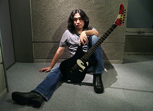
Jun is known for using ESP guitars with Sonic the Hedgehog's face on them. He uses a close-up of one of these guitars as his Twitter photo, so it becomes more a part of his image.

Online Presence


On the topic of Twitter, Jun routinely answers questions his fans ask him about his various works; which shows him connecting to fans - thus allowing them to feel closer to him and feel more likely to buy the music he puts out.


As I mentioned earlier, Jun manages a YouTube channel on behalf of the band. Earlier this featured some camera footage of concerts which they'd had some friends film, however as they've obviously had a bit more funding available to them recently they've now uploaded some higher quality concert footage. It's also used to tease new releases, to create hype amongst the fanbase. An example of one such video is this, which contains samples of the songs from Rise Again:


-HM.

Tuesday, 15 January 2013

Production Update 5 - ...And the law won

My original concept for the video's narrative involved me threatening my friend Stephen with a replica sword and a replica gun. I went looking for props and found out something which has quite an impact on my ability to do this... turns out the things are illegal. Not just in public places, but to own in general in the UK.

I could have went with a cop-out and just use obviously fake props, but that would look terrible, and given my reaction to the Porcelain recreation it should be obvious that I don't want to be putting out  sub-standard work. If it's obvious that the weapons aren't real, the threat scenes just wouldn't have the same effect.

Because of this, I ended up having another brainstorming session, which has led to a possible change of pace. Here's the general gist of where I'm going with this:

  • First section: the two characters are shown in the same area in a public place (a street), with the performer being made aware of the "victim". He is shown staring at the victim as he walks past.
  • Second section: In a slightly less public place (a quiet park) the two characters are shown to interact; the performer is shown pushing the victim out of the way. This section features rapid cuts between this, and the performer looking through personal possessions (it is implied that this will be used to harm the victim character).
  • Third section: Set in an alley with just the performer and victim present. Rapid cuts are increased; this features a lot of close-ups on the performer's face, highlighting the unstable emotions present. The video will finish with the performer walking towards the camera from the darkness; I'm not sure as to whether I want him to actually attack the victim or not. I'm tempted to film both possible endings for the sake of checking which works most effectively in context.
As I still wish to include the whole light/dark concept, the three narrative sections will be set at different times of day. The first scene will be in bright daylight - this is representing the performer in his neutral state - he's acknowledged the victim's existence, but he hasn't done anything wrong. The second scene will be filmed later during the day, where it is getting darker - probably around mid-afternoon. This shows him being a tad more aggressive. Later, when nightfall strikes, our performer is filled with pure black-hearted evil, and so he goes out of his way to find the victim and confront him.

On another note, in terms of time management - originally myself and Mr. N. were going to get the performance sections filmed after school tonight, but he's had IMPORTANT TEACHER BUSINESS come up. For now we've conditionally set Thursday as our day to film after school, but this depends on whether the snow has cleared up (I really don't want to be lugging all of the equipment backwards and forwards from home to school in the snow...).

-HM.

Thursday, 10 January 2013

Production Update 4 - With added TIME

As I was saying in the previous post, I am quite satisfied with the effect I achieved in the test edit, so I will be using this approach when I film and edit the final I Am... All of Me video.

Speaking of which, I have made arrangements as to when and how I will be refilming the performance parts of the video -


  • I will be filming after school on THURSDAY 17th JANUARY.
  • I will be filming in the media studio in school - whilst I filmed my test footage in my bedroom, the area used is too small to film myself with the guitar performing from multiple angles.
  • Mr. N. has offered to help with the filming (by which I mean Mr. N. has been told that he will be helping with filming) by lending me a few more Bloggies to capture footage from multiple angles as we did last time, to be in charge of the lighting by holding and moving the mini torch as necessary, and moving the camera in the strobe shots.
-HM.

Thursday, 3 January 2013

Production Update 3 - Electric Soldier Guitar

A day earlier than promised! Huzzah.


In this video, I decide how I'm going to go about filming with the strobe light, and then have a go at testing the editing effect I wish to use in the final piece.

The idea behind the shots in that test at the end is that the guitar on the stand is a placeholder for me. I couldn't be in this as I was in charge of the camera and the torch - when I film the final thing, I'll have someone else covering those duties.

From this I've established a few things -


  • The qtxlight strobe light seems to be the most practical to use when filming the video; so I will use that when recording my main performance.
  • The rapid cuts to the strobe shot actually work well! This is something I'm really glad about; it creates the 'detached' feeling I've been aiming for since my original concept.
  • The contrast between static and moving shots work well - the regular shots are static (well, as static as they can be when I'm holding the camera without a tripod whilst also moving around a torch...) whilst the strobe shots have a degree of movement to them. In the final piece, I will use a combination of pan and zoom shots - more variety will re-emphasise the detached concept.
  • The torch also works well! I wasn't expecting this; I just used it for the test due to a lack of better lighting. I could use the torch to create a similar effect to what I was originally going to use the chroma-keyed backgrounds for - to show the light floating around, representing the clash between hero and dark in the performer's mind.
-HM.

Wednesday, 2 January 2013

Planning Revisited

As mentioned previously, I had intentions to use the green screen to film the performance element of the I Am... All of Me video. I am now reconsidering this for these reasons:

  • Editing is going to be a problem - when I'd decided upon the light and dark background effects, I hadn't really considered that I'd need to make alternate versions of each (animated!) background for each type of shot. This would be impractical, and would probably lead to a ton of potential errors due to the amount of different things which would be going on.
  • It just didn't look right - I tried editing together a sample with a placeholder background and the cuts looked really awkward.
After a discussion with Mr. N. about this issue, I brainstormed some other ideas - 

  • Film in an actual location - I intend to now find a dark place in which to film the performance parts. I will be keeping the light vs. dark concept, only now I'll be using a strobe light to create the light parts. I'll make a separate update about the strobe light later on.
  • Rapid transitions - Inspired by the I Am The Least of Your Problems video, I've thought I could approach transitions in a different way. In the past I've always just used a straight-up cut from one shot to another, but for the sake of making it more interesting to look at, I could attempt using sudden rapid cuts as a transition.
This will mean I will need to refilm the performance parts of the video. For the sake of effective time management, I will now establish when I am going to do this:

  • Tomorrow (THURSDAY 3rd JANUARY 2013), I will film some test footage using the strobe lights I have borrowed from school. This will help me work out how would be the most effective way of using them, in terms of position and light tempo. I will edit this footage together to see how it works, and have it uploaded by the end of the following day - FRIDAY 4th JANUARY 2013
  • After this, should everything go to plan, I will film footage which I hope to be usable for the final video.
-HM.

Thursday, 29 November 2012

Production Update 2 - File Management


So yes, I have imported the clips from Thursday's performance recording session into Final Cut, and have separated them into bins based on the kinds of shots.

This may not be a conventional organisation manner, but I have my reasons - right now I am focusing solely on the performance section, and will worry about narrative later. Because of the untamed nature of my character's mentality, I want to borrow parts from as many takes as I can, to give a disjointed tone to the video. Provided they can all be chroma keyed properly, I hope to use something from each of the clips (excluding the PRODUCTIVITY files; those are ones from the green screen test montage which I imported by accident. Failure.).

-HM.

Friday, 23 November 2012

Production Update 1 - It begins...

Yesterday, as mentioned in the planning post, I started filming the performance section of the video, with assistance from Mr. N..

In terms of equipment, I decided we should approach this with a multi-camera setup; this is because I want to have multiple different angles and using multiple cameras for this is less time consuming than having to shoot each part over and over for each angle. I would usually point out that this also helps out with avoiding continuity errors, but in this case I'm actually going out of my way to avoid perfect continuity from shot to shot to represent the broken manner in which the performer sees himself (the whole light vs. dark thing).

The cameras we've used are my Bloggie which Mr. S. issued me at the start of last year that I've sort of... kept, and three more Bloggies which I borrowed from the Media Studies department.


To keep the cameras in place we used the tripods from the store room; each one of these attaches to the camera in a slightly different way which is wonderfully inconvenient... but oh well. They did what they needed to do.

I also borrowed Sir's laptop - this was used to play the song which I could use as reference when miming. A slight problem I've noticed is that in some parts I am slightly late starting; though this can easily be fixed with the "left a bit, right a bit" method in FCP.

Unfortunately as the backup of the footage is on the school computer I'm not able to put together one of those fancy raws montages like I did with the Sheena is a T-shirt Salesman raws; but I do have my Bloggie with me so enjoy these screenshots of me looking like a complete plonker.


-HM.